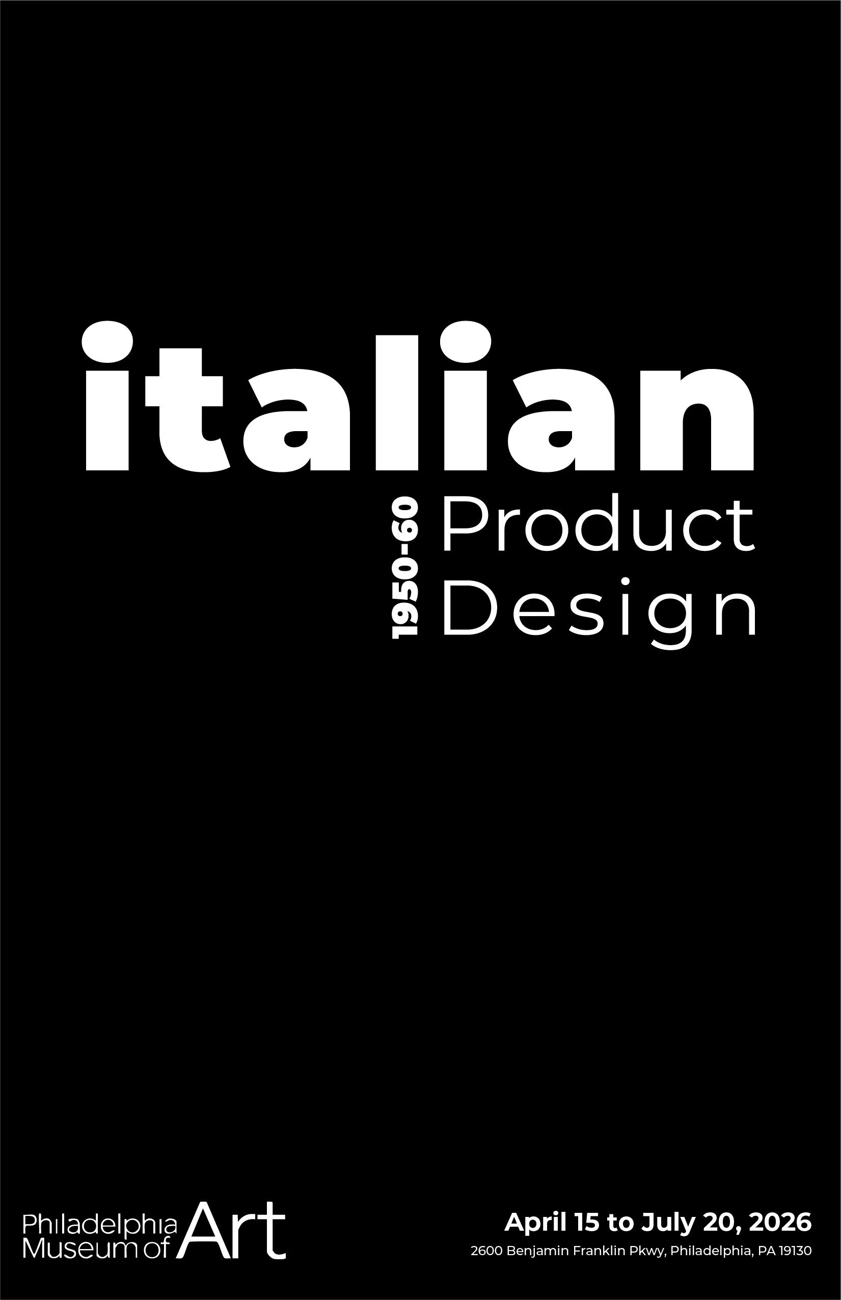
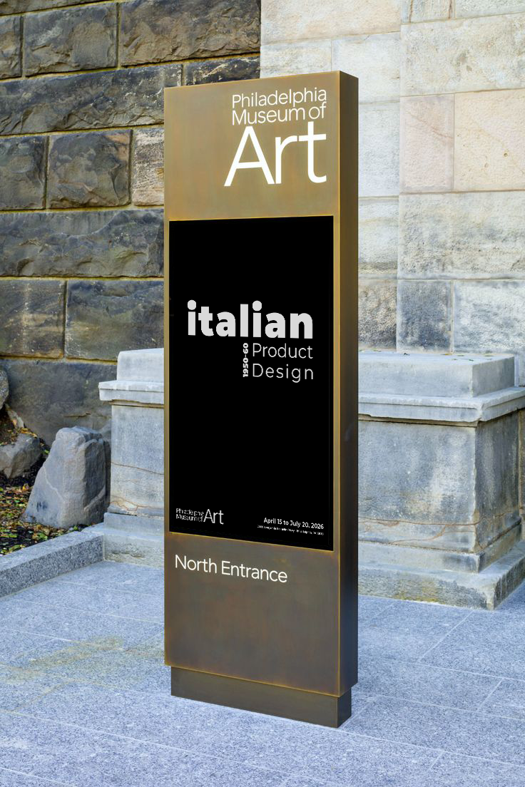
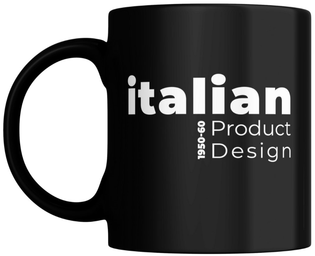
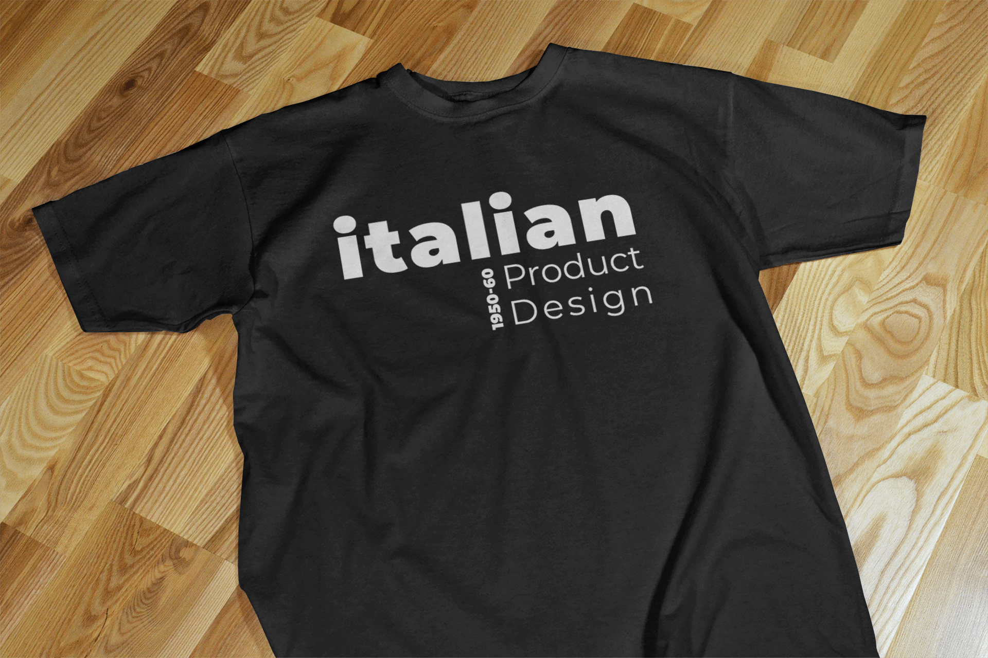
Italian
Product Design
In this project, I imagined a spotlight exhibition at the Philadelphia Museum of Art celebrating Italian product design and took on the role of designing its logotype. Wanting to challenge myself, I worked entirely in black and white, focusing on how typography alone could carry the identity. I chose Montserrat as the typeface, drawn to its blend of soft curves and sharp angles—qualities that echo the elegance and structure of Italian design from the 1950s and 60s. The resulting logotype leans into geometry and precision, mirroring the clean lines and intentional forms of the era.
Tags: Typography, Brand Identity